Creating a fast, familiar writing experience in Whimsical
Amy Brumet · October 25, 2023
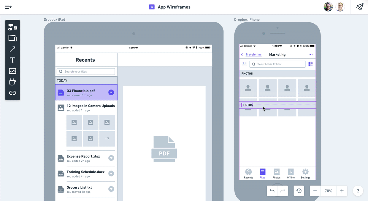
How We Designed Wireframes in Whimsical

Wireframes are incredibly useful. They’re great for quickly exploring concepts. They make it cheap to go wide with the initial exploration of ideas, which is vital to arriving at great solutions. Wireframes can get the conversation going in healthy ways early on in the idea phase of a project. But the existing tools for wireframing just aren’t cutting it. Each of them fall short in one way or another.
Slow and Too Detailed Most wireframes these days are designed in Sketch. Sketch is an extremely powerful tool but it’s not built specifically for wireframes. You have to create your own symbol library or install a pre-built one. Lack of search is painful – you’re forced to repeatedly comb through a sprawl of nested menus. Sketch is also too detailed. It forces you to waste time with styling decisions and pixel nudging as opposed to rapidly exploring your ideas.
Too Complex for Non-Designers Even with all the progress that has been made over the past few years, the initial learning curve with high-fidelity design tools is high. Non-designer team members are frequently left without a great option for exploring their ideas. Yet it’s undeniable that great ideas come from the entire team, not just designers.
Not Collaborative Most solutions aren’t collaborative and require additional tools for commenting or real-time collaboration. Figma has made some great advances in this area but has the exact same issues as Sketch does with a high learning curve and being too slow and detailed.
We built wireframes in Whimsical to be fast, simple, and collaborative. The app is custom-built precisely for the purpose of creating wireframes. It’s incredibly easy for non-designers to pick up. And at the same time, full-time designers who spend all day in Sketch will feel right at home.
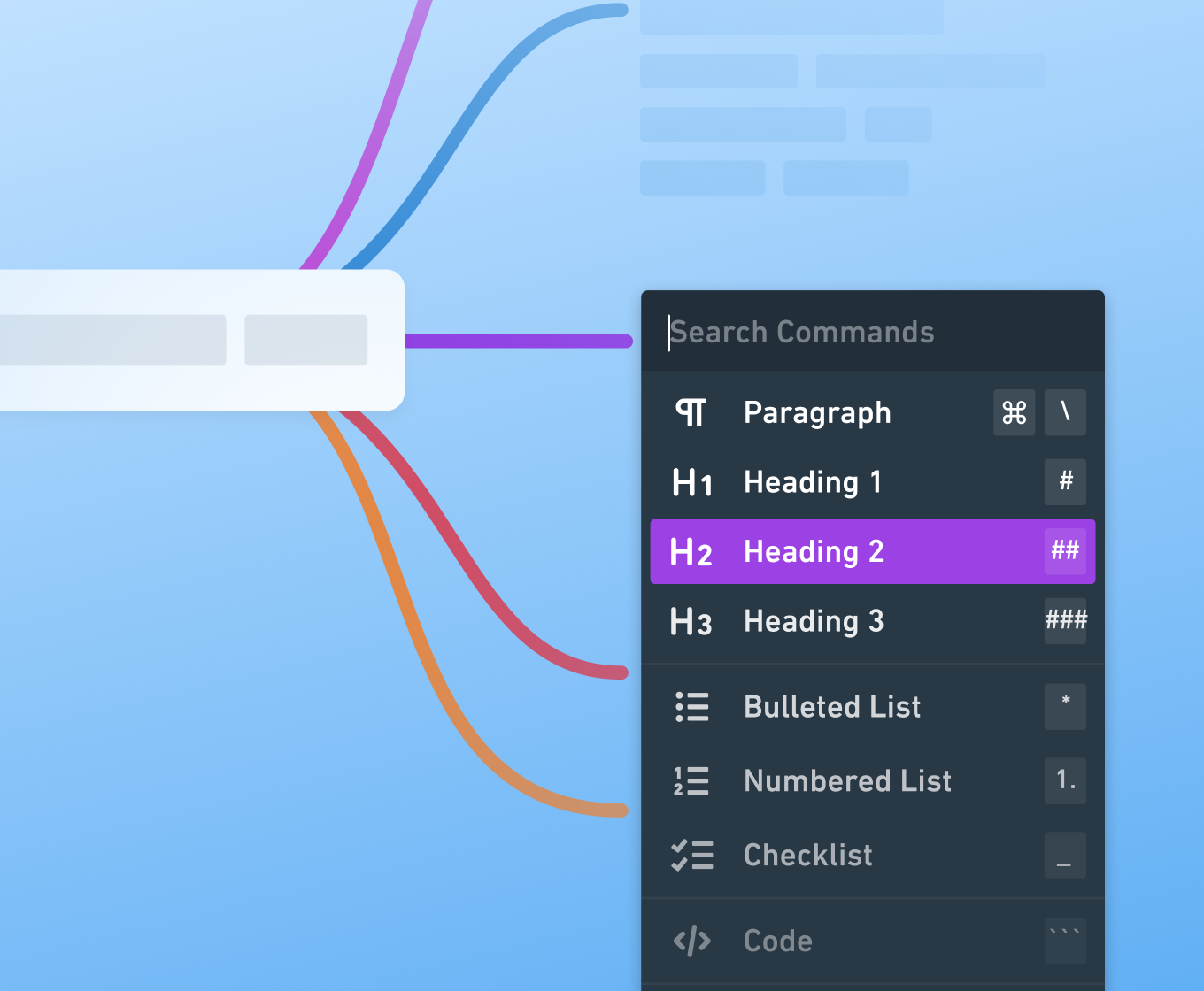
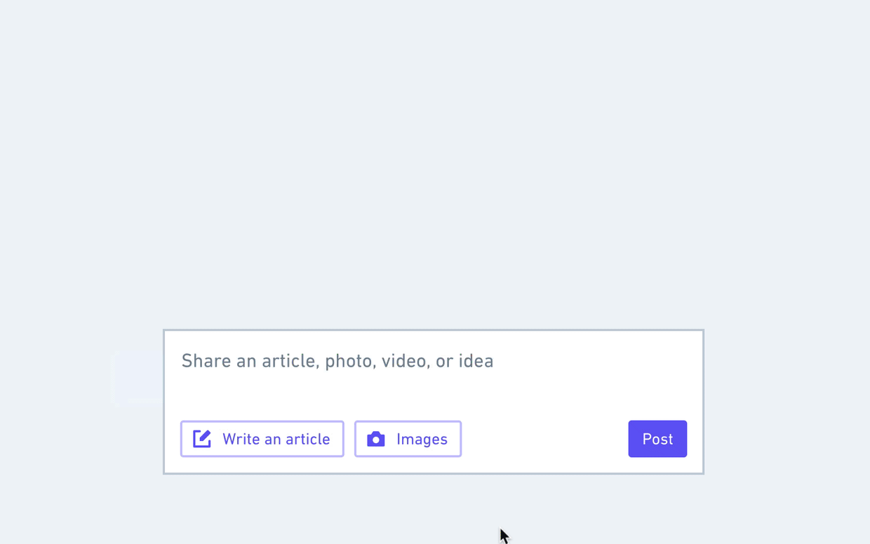
When you have a fresh idea that you’re itching to explore, the last thing you want to do is waste time designing a checkmark icon. Yet if you don’t have a fully built-out design system in place, a lot of times you find yourself needing to build along the way. This is why our wireframing app comes pre-loaded with a comprehensive design system that has everything you need. Not only is it all pre-designed (including disabled and focused states), it’s searchable and can easily be controlled via the contextual menu bar.
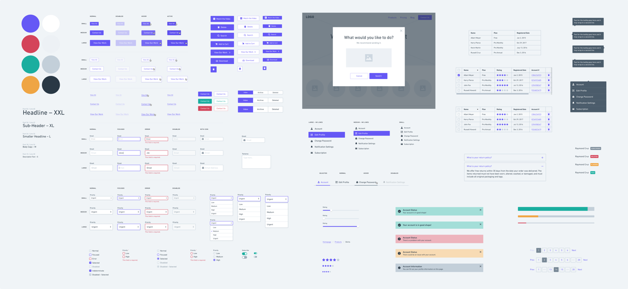
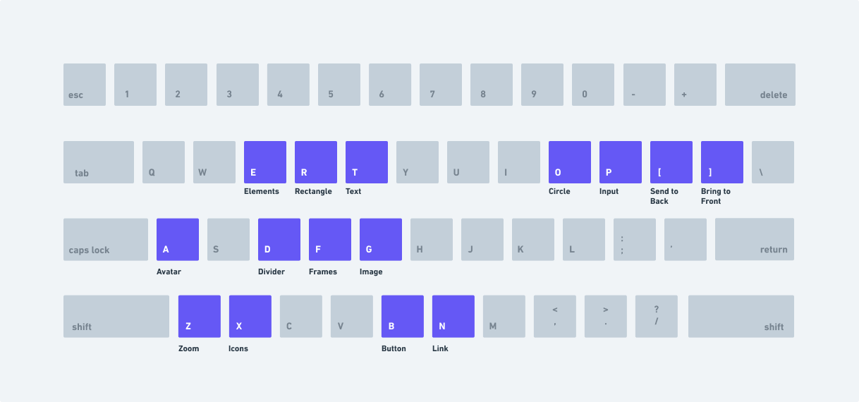
It can feel like a lot when you zoom out. But honestly, if you look closely at the majority of the websites and apps out there, it’s amazing how few components are really used (this is especially true for marketing sites). Buttons, text, images, and a few form elements can often get you most of the way. Because of this, we optimized the experience for these core elements.
We looked at the fundamental building blocks that are used most frequently and then added shortcuts for the majority of them. B for button. A for avatar. D for divider. G for image. The real beauty of it is that most of them are mapped to the left hand on the keyboard. This makes for some serious speed enhancement as you can practically keep your hand on the mouse the entire time!
Auto-Sized Buttons: Whenever I open a wireframing app, one of the first things I do is check whether or not the buttons auto-size to the text. It’s a serious pain to have to adjust the button width each time you change the text. Sure, there are some plugins for Sketch and I know Balsamiq has had this for ages, but you’d be surprised how many apps don’t have it.
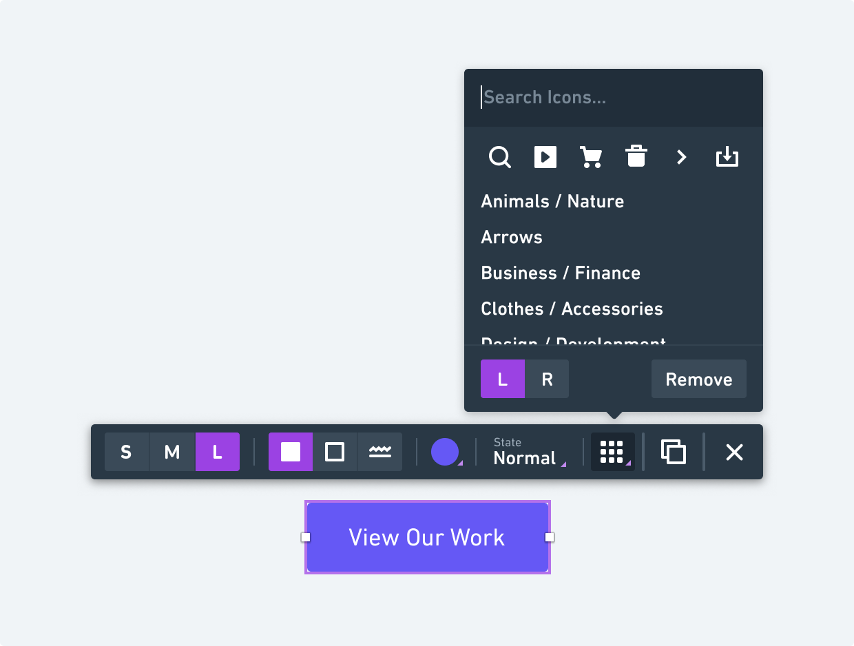
Search: Another detail that makes wireframing in Whimsical super fast is being able to search through all the elements. And access is super easy because you can trigger the search with a shortcut. It’s actually kind of fun 🙂
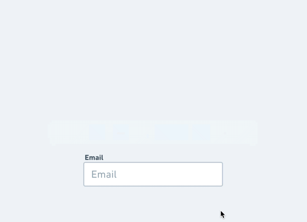
Quick State Changes: Once you’ve added your element to the screen, you can change the state directly from the contextual toolbar. For example, you can go from the default text input, to the focused state, and then add text to the input and the cursor will automatically adjust.
We already detailed some of the time-savings in our post about designing Whimsical for speed but this is just as much, if not more, of a time-saver for wireframes. It’s just one of those things that you can waste a lot of unnecessary time on. In Whimsical, we have thousands of high-quality icons that are all easily searchable.
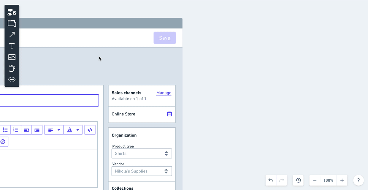
Contextual toolbars are a big part of Whimsical. They help you move fast and keep the interface nice and clean. We created a solid set of patterns for these toolbars when we made Flowcharts. The toolbars in Wireframes are built right on top of this foundation but take them to the next level.
One of the biggest challenges in creating wireframes is keeping them focused on the right things. At this stage, it’s about the big ideas, the content, and the general layout. It’s not about the high-fidelity design choices (things like color, style, illustrations, animations, etc.). The best wireframing app keeps you centered on the appropriate things. One of the best ways of doing this is to limit the available options and the number of choices that need to be made.
We tried to make color usage inside of our wireframes very intentional. Almost everything is gray or white. This includes virtually all the shapes, icons, text, etc. The only color that is used at all is for the actionable items (buttons, links, etc.) and also any colors necessary for conveying meaning like red for error/delete, orange for caution, or green for a success state.
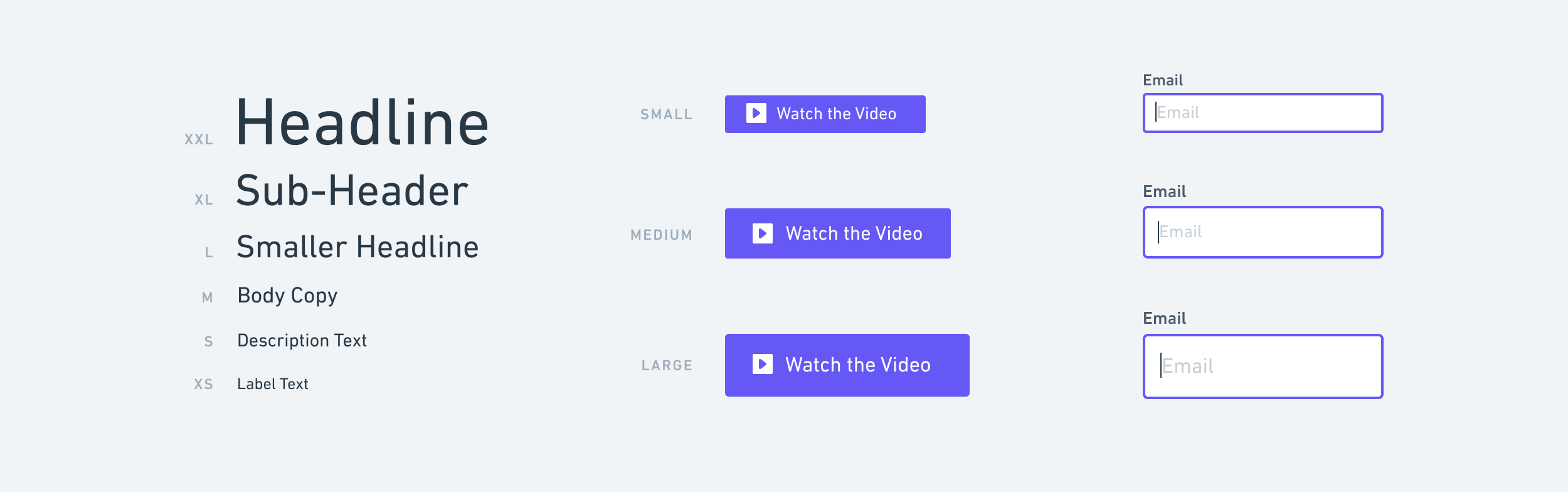
Much like in our flowcharts, we’ve limited text down to t-shirt sizes. You only have 6 sizes to choose from. This way you can move faster without being distracted by things like setting your line heights or picking between 42 and 46 for your headline font size.
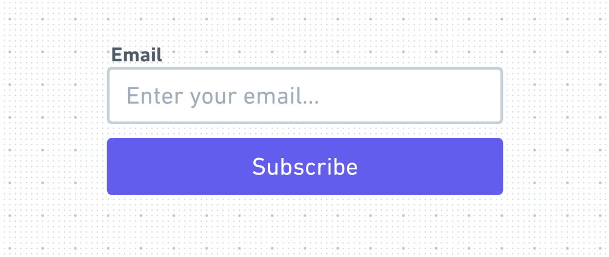
The other place we constrained size was inside a few of our Elements. For example, buttons can be Small, Medium, or Large. All the details are automatically set for you – the height, text size, padding, icon placement. It’s the same for input fields. You don’t even have to think about those details at all.
Fidelity of wireframes is an interesting balancing act. One of the biggest mistakes at this stage is sinking too much time into details that simply don’t matter. In the book Rework, by the guys over at Basecamp, they talk about starting their designs by sketching with a sharpie. This literally prevents you from drawing anything less than the big picture. All you get are the main details, layout, and ideas. And that’s all you want at this stage.
That being said, wireframes should at least generally represent the patterns and scale of the finished product. If you go too low-fi, you can end up with something that isn’t even close to reality or is so abstract it’s not much help.
One subtle thing we did to help shape the fidelity of wireframes in Whimsical was we built everything on top of a 4px grid. This gives you just enough control and placement but helps avoid the constant pixel nudging that happens so often in Sketch.
We also avoided 1px lines altogether so that the wireframes have a more basic feel. This includes dividers, borders, text inputs, link underlines, and the like.
Here’s where things get interesting. You can have unlimited teammates and collaborators working in the same wireframe document at the same time. It’s the “Google Docs” experience for wireframes.
This makes things like live ideation sessions and workshops a breeze. Design reviews are as easy as sharing a link and hopping in the document with a coworker.
Async collaboration works just as well. You can share the link once and it will always be up to date. Invite as many people as you want to view and comment on your designs. No need to sync over to InVision every time you make an update or want to add some feedback.
We built wireframes in Whimsical to be fast, simple, and collaborative. We hope it empowers your entire team to ideate with more speed than ever before so that you can create your best work and have a blast while doing it.
Align on your next build faster with Whimsical docs, flowcharts, wireframes, & mind maps.